

In order to consolidate our Eye Candy coverage, we’ve developed a brand new feature: Unwrapped! We’ll take all the new photoshoots from the week and grade (or “brand”) each based on the following criteria:
• Poses (are they versatile or just glorified statues?)
• Uniqueness (have we seen this photoshoot a billion times before?)
Grading scale: Sweet (Great)/Bland (Iffy)/Sour (Awful)
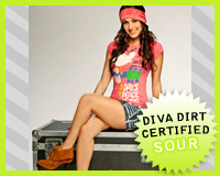 Brie Bella‘s Flower Power
Appearance: Apparently, Brie’s celebrating the 40th anniversary of Woodstock, as she’s wearing a t-shirt of the poster for the famous musical festival. And, I guess to supplement that, she hippy-fied the rest of her look. Well, the shallow version of “hippy”, anyways. She’s wearing moccasin-like shoes, a tie-dye headband, and a shredded denim skirt. It’s a lot of things competing for attention, and it looks a little too costume-y. It’s like she took one person’s idea of what the 60’s were and threw it together for one outfit. I’m surprised she wasn’t wearing peace sign earrings or something. The pink is a pretty color, though–it’s the first thing that I noticed about this shoot, and as much of a mish-mash this look is, the pink makes it a little more pleasing to the eye.
Poses: It’s all peace signs and sweet smiles from Brie, all while lounging on an equipment trunk. It’s pretty dull, and can’t say I really understand the significance of the trunk–if anything, it exposes a stark contrast between the “buck-the-system” mentality of Woodstock and the “corporate stiff” status of the WWE. It just shows the shallowness behind the concept of the shoot. Not very well thought out..
Uniqueness: A silly, contrived WWE photoshoot? Come on, we see those things all the time.
Grade: Sour. It’s just another WWE mish-mash of a photoshoot–concept and execution don’t really meet. I know it’s ridiculous to even fathom a politically-charged photoshoot, but something like this is just silly and shallow. It’s akin to Miley Cyrus throwing around the peace sign just because it looks cute.
• Click to see the rest of the photoshoot.
Follow the cut to see the rest of this week’s photoshoots.

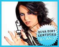 Katie Lea‘s Gorgeous Locks and Key
Appearance: It’s your typical Katie Lea Look–dark, gothic, and slightly creepy. She’s wearing a black netted top, blue (suede?) leggings, and an assortment of black accessories including a key, which is hanging from her neck. Her eyes are done up in some heavy makeup that looks cool as hell. It’s very Halloween-like, but Katie can pull it off any day of the year. The entire look isn’t something that a typcial Diva would wear, but Katie Lea isn’t your typical Diva. In that sense, since it’s in keeping with her character, I can respect her unique vision, even if I’d never wear it myself.
Poses: Katie Lea’s signature poses entail a lot of soul-staring and hand posing. It’s something she pulls out every time, but it never fails to catch my attention. That’s the point, too, I guess. It keeps her character in the photos, and you never forget that you’re looking at Katie Lea–WWE’s resident freakish Diva. She’s not going all cheesecake on us, and I can respect that. The key is a bit of an obvious prop, and photoshoot props by their nature are cheesy, but she’s only using it in a few photos, so I’ll let that pass.
Uniqueness: It’s not all that unique by Katie Lea standards, but any Katie Lea shoot will stand out amongst those of her Diva peers.
Grade: Bland. It’s full of creepy clothing and creepier posing, not to fabulous results, but I like that Katie obviously puts some thought behind her photoshoots. She’s not satisfied to do the standard Diva thing, so even if the shoot isn’t the greatest thing I’ve laid my eyes on, I can’t quite hate it. Maybe one day this routine will sour for me, but it’s not happened just yet.
• Click to see the rest of the photoshoot.
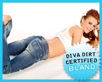 Maria‘s Blue Jean Baby
Appearance: For a Maria ensemble, this look is pretty damn simple–she’s not even wearing shoes! Maria’s wearing a pair of jeans that look like they went through a paper shredder, along with a midriff-bearing white top. And it wouldn’t be a Maria outfit if there wasn’t some sort of glove involved, this one being an elbow-length one covered in hearts. As with every Maria look, it would benefit greatly by losing the glove. I don’t care if it’s her “signature”–it looks stupid. Other than that, it doesn’t look bad at all. The lack of color helps bring out her red hair, which looks quite pretty up in a relaxed ponytail. I guess this is how Maria does “minimalistic”. I wouldn’t mind if she tried it more often, as it’s much more flattering than some of her other looks.
Poses: It’s a Maria photoshoot, so there’s enough fish lips to open a Red Lobster, but we must look past that. The poses themselves are pretty relaxed, one even featuring Maria in the fetal position. I really like the ones where she’s laying down–they look natural and fun instead of the certain type of “try-hard” sexy moves that many Divas have in their employ. For the most part, the poses are pretty nice, even if I have to cover a certain part of her face to appreciate them.
Uniqueness: It’s fun and relaxed, which is not usually Maria’s style, but I like the change. It’s certainly not something she’ll stick with, but I’ll enjoy it now while I can. You know what would be REALLY different for Maria? If she burned the gloves. Yeah I know, I should keep dreaming..
Grade: Bland. I was actually planning on giving this shoot a “Sweet”, but then I saw the glove. Oh, the glove, one little piece of fabric that was irk-inducing enough the tip the scales back to “Bland”. I’m sorry, but I just hate the damn thing.
• Click to see the rest of the photoshoot.
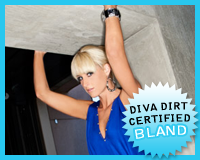 Michelle McCool‘s Blue Angel
Appearance: I love cobalt blue, so Michelle’s dress definitely caught my eye. However, it’s not much of a flattering cut. I guess it’s better than being skin-tight, though.. The whole look seems to be going for a futuristic type of edginess–lots of metallics and sharp edges. Michelle’s blunt bangs and heavy makeup are a bit jarring in the high-contrast lighting, and I can’t help but think they could’ve done more with her hair than just tie it up like that. The haphazard updo just makes the dress look even more overbearing on her. The shoes and jewelry are lovely, though. I love the grays colors.
Poses: I’m guessing they just went out to the parking garage and let Michelle climb on some barricades. It’s an odd setting for her look, and it just clashes. From the awkward stooping poses to the almost-upskirt shots, this shoot looks like it stalled at the conceptual stage and they just went on anyways.
Grade: Bland. Michelle looks quite nice, even if I’d make a few small changes, but the setting and poses just confuse me. They should’ve just placed her in front of a reflective surface and gone from there–at least then the look and setting would’ve complimented each other a bit.
• Click to see the rest of the photoshoot.
 Natalya‘s Pink and Black Attack
Appearance: She’s in her signature Hart Dynasty gear, which means an overabundance of pink and black. Which, strangely enough, correlates with the photoshoot’s title. Aside from being covered in Bret Hart’s favorite colors, Nattie has a bit of yellow streaking across her top. I like it, even if it makes her look a little “Tarzan” with a loincloth top. For someone that has to wear the same colors week in and week out, at least she’s keeping it interesting.
Poses: She’s a heel, obviously, so seeing her be all smiley and friendly doesn’t quite connect, but I’ll be damned if she doesn’t look cute doing so. Though, the poses on her stomach are a little too teenaged girl “Tell me more!”–it just doesn’t seem like the Natalya I watch on TV. You can take that as a bad thing or a good thing, I guess..
Uniqueness: Natalya’s done plenty of photoshoots in her ring gear, so there’s nothing particularly groundbreaking about this shoot.
Grade: Bland. The poses are a little too happy-go-lucky (did she switch souls with Mickie James?), but I always find her Hart Dynasty interesting to look at, so there’s that..
Click to see the rest of the photoshoot.
Now that you’ve gotten our perspective, which photoshoot did you like best? Vote in the poll below and sing your song in the comments!
[poll id=”401″]